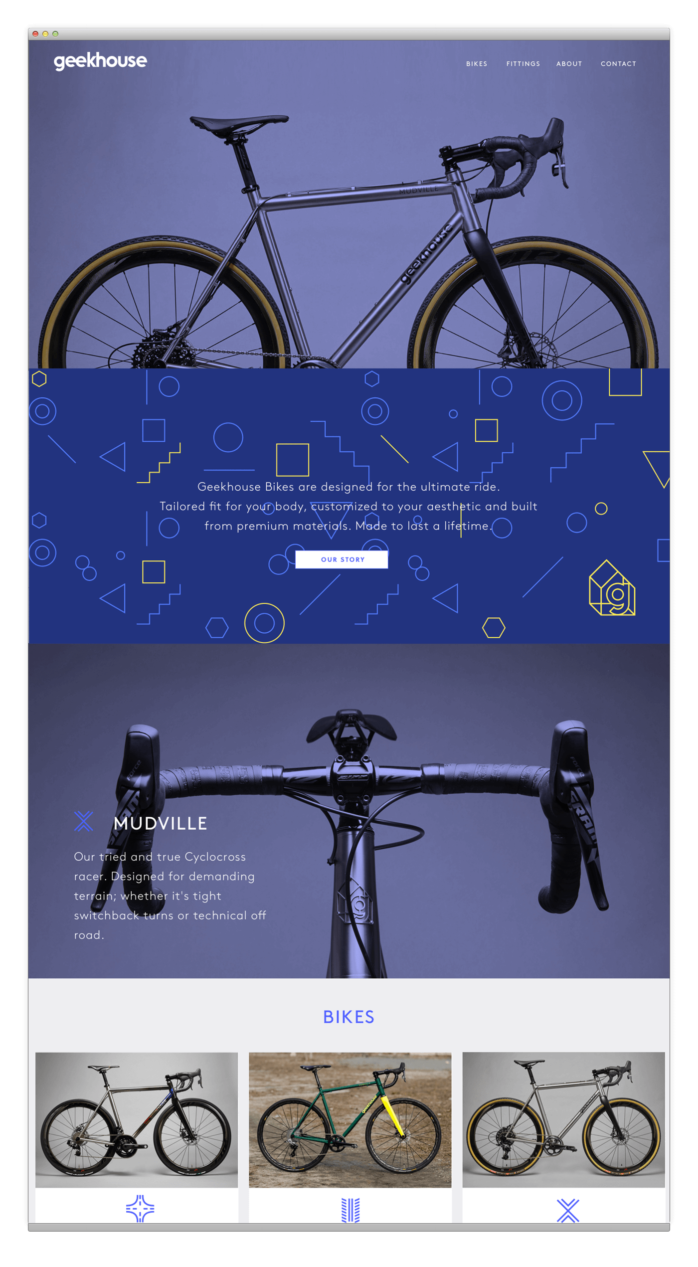
Geekhouse Bikes
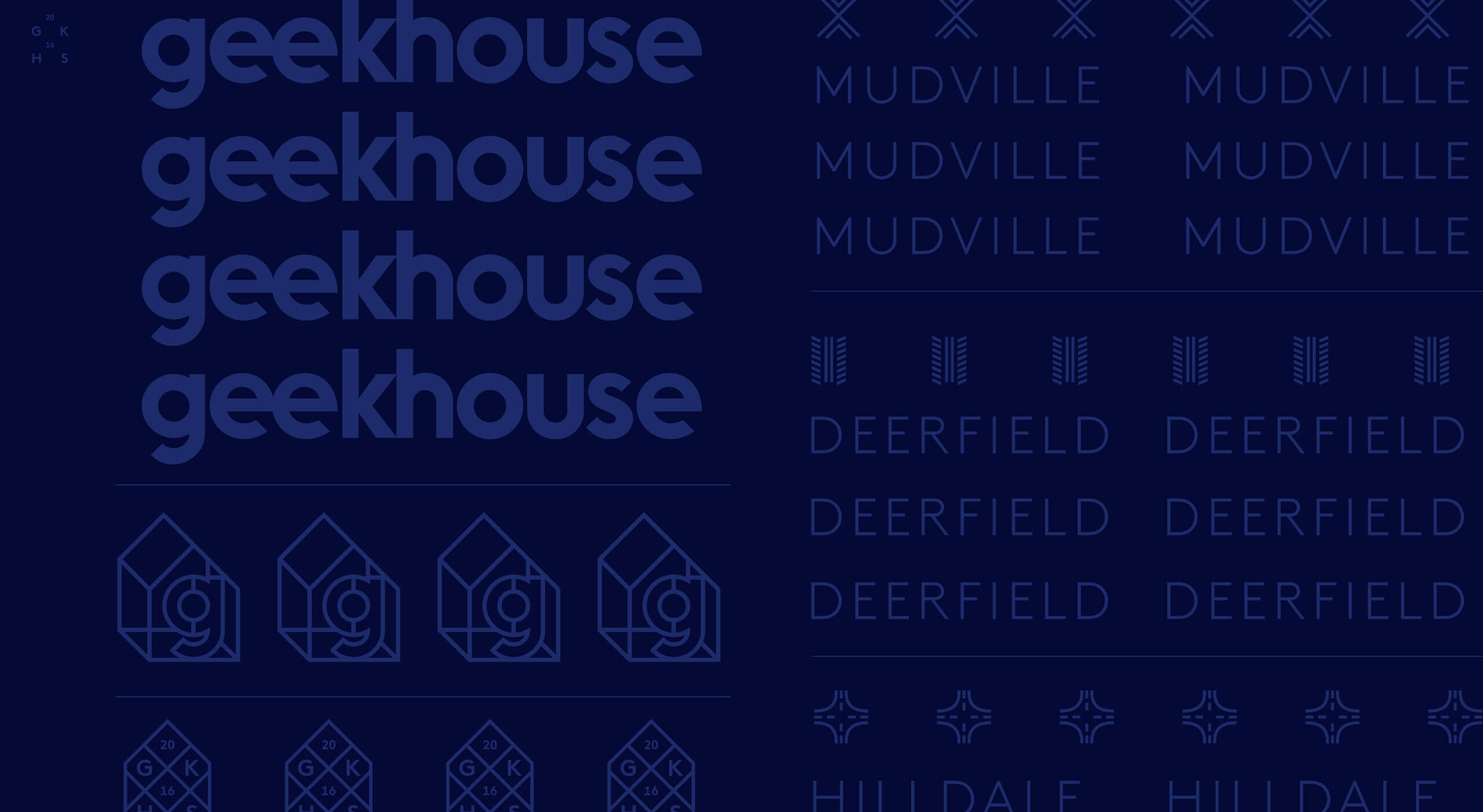
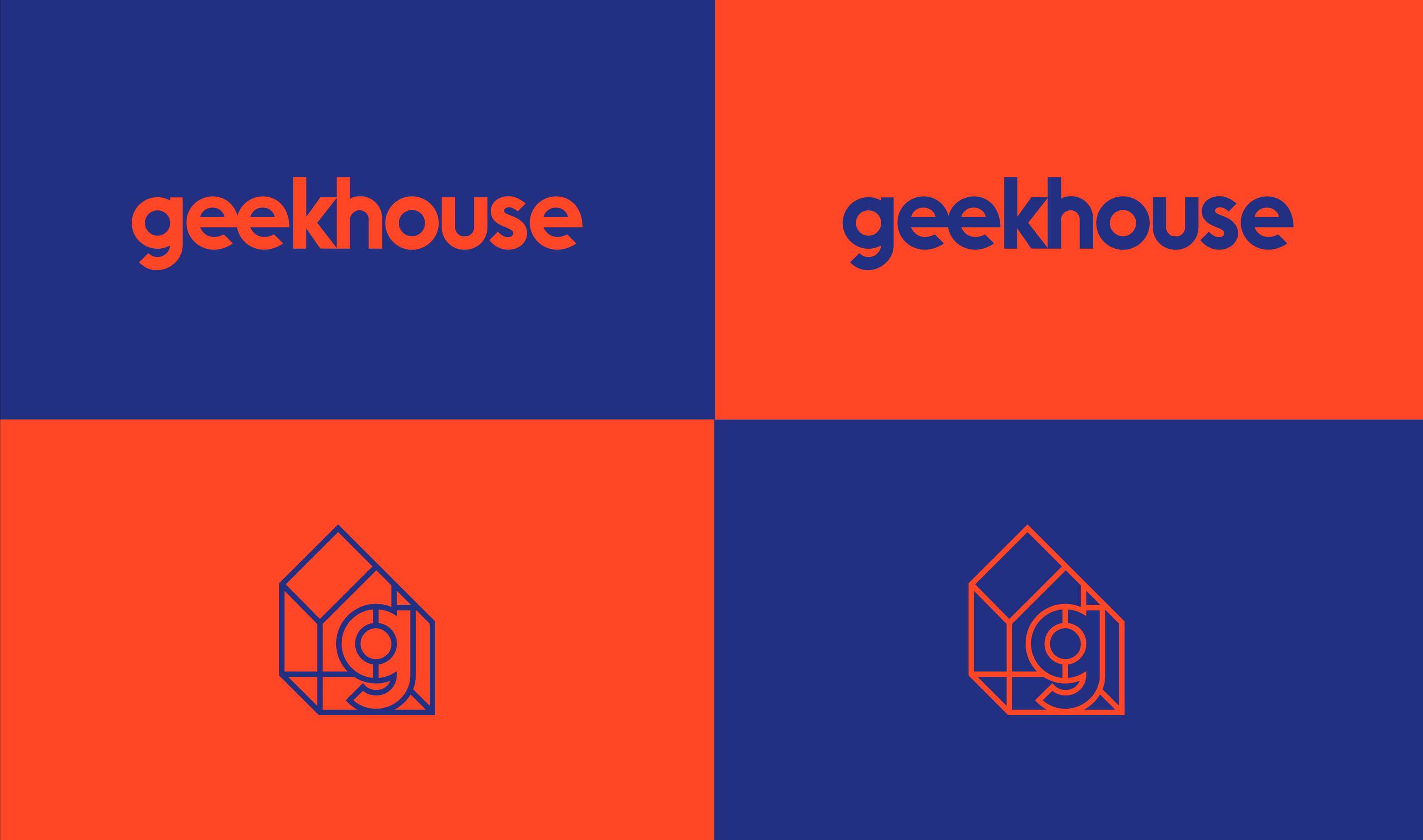
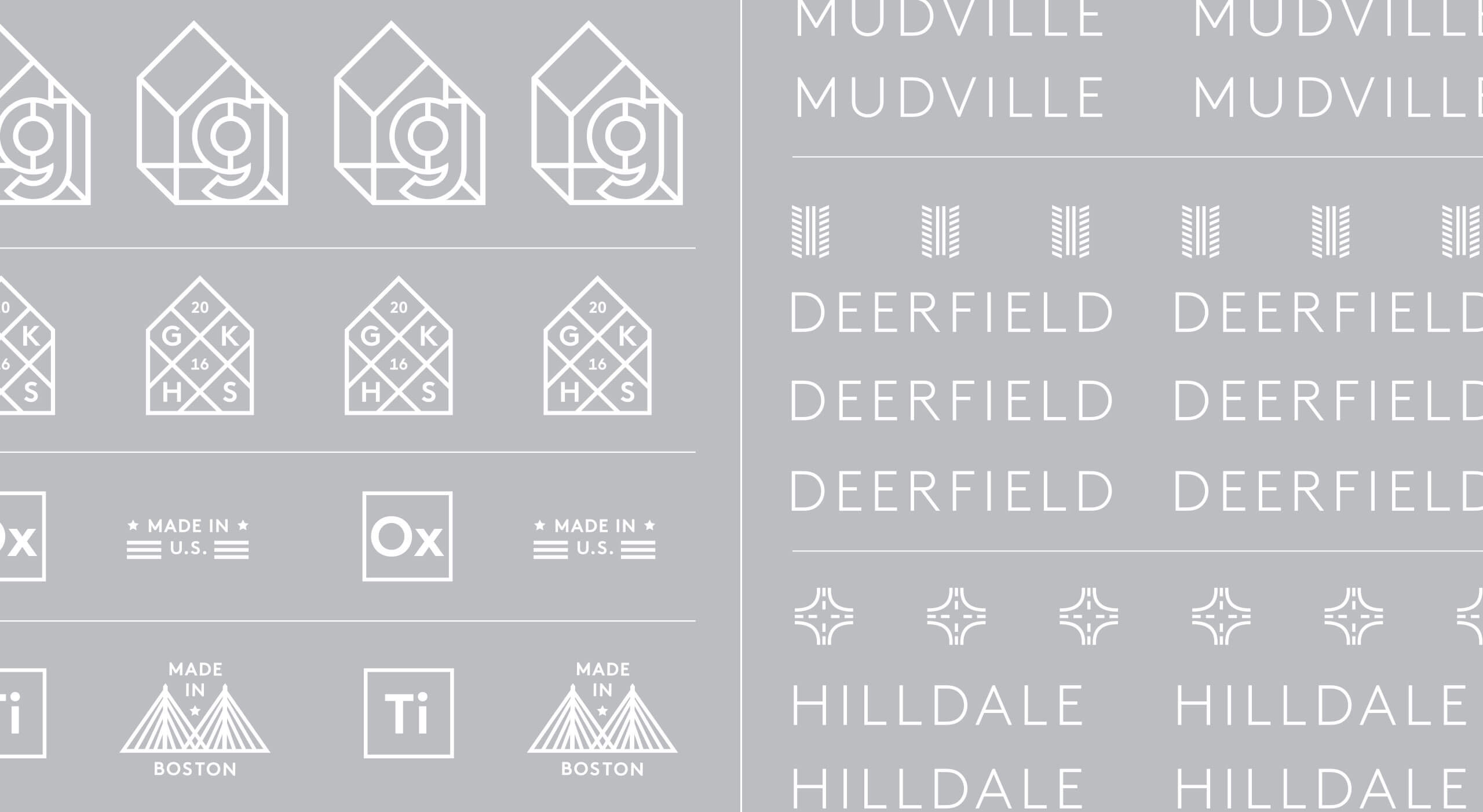
The Geekhouse brand visual identity was built on three core principles; innovation, intellect, and irreverence. These principles drive the company’s passion for cycling while maintaining a fresh perspective on health, social responsibility and simply having fun while out riding. The logo and visual strategy emerged from the need for a streamlined production process and a concise modern aesthetic. Based on geometric typography, lines, shape and intriguing color combinations were explored in the process.
Visual Identity System, Sticker Sets, Art Direction, Website Design
A friendly lowercase logotype and an iconic house logo mark were crafted to echo the process of building something that fits your body, personality, and lifestyle. A three-dimensional exposed beam house shape derived from Geekhouse’s original logo was made into a more deliberate and solid structure. The logotype was crafted with classic elements of uniformity, mathematical geometry where letterforms were equally weighted and precisely spaced. Utilitarian in nature, but customized for a perfect fit.
CONTACT ME
hello@monicagreenwald.com
+1 917 755 9507
Instagram
LinkedIn